We know it when we see it — but what exactly is good design?
Fused glass artists can see an outstanding piece of glass and know that it's good, because the human brain is adept at recognizing beauty. And often we say to ourselves: "How do they do that? How do they make work that wonderful?"
This course will investigate these questions: What makes a good piece good? Why is it beautiful? Are there lessons to be learned from well-designed work that can be applied in your own studio? Can you take your work to a new height without having to learn another technique? Can you learn to improve your work using the skills and techniques you already have?
The answer to all of the above is yes. Whether you are a beginner just starting to explore, or a seasoned artist with many workshops and lessons under your belt, you can advance your work with knowledge that transcends technique.
Some people are simply born with a great feel for good design. We've seen artists with little or no art education do outstanding work because they simply have an eye and an intuition for it. Kat and I are not in that group of innately gifted artists. We have to work at it. For most of us, it requires effort and practice. That said, there are things you can learn and principles you can apply to push your work forward. You can learn to think your way into good design. And the more you do it, the easier it gets. After awhile, it becomes intuitive.
We've seen it happen. Pretty soon you'll be in the grocery store, analyzing the package design on a carton of ice cream.
What this course is —and what it's not
We're not fond of the word "theory" in this context. It sounds intimidating. This is not a course in design theory. What this course teaches is practical, user-friendly and glass-specific ways to apply some basic design ideas to your fused glass.
Design for Glass Artists is, in part, about giving artists a few terms — a small design lexicon, if you will — to help them articulate, think about, and discuss design. Words like space division, contrast, and dominant element. If you can understand these terms, and talk about them to yourself, you are on your way to using them in your work.
Another thing: this is not a course that teaches a technique. Rather, it's a new way to think about how to use the techniques and skills you already have to give your work some thoughtful design structure and polish.
We just want to help you make better fused glass.
Learn design by doing what you already do.
This course is taught by looking at and talking about good fused glass work. A lot of work. Some of it you may recognize. We'll discuss what makes the pieces sing. It always comes down to our four main principles: Dividing the Space. Contrast, Dominant Element, and Grace Notes. It's kind of like forensic accounting, but with glass. And through the everyday miracle of Photoshop, we alter some images to show how they could look with less design consideration, or how so-so work can be improved by editing the spaces.
Learn to identify, talk about, and use the design concepts that make these pieces work.
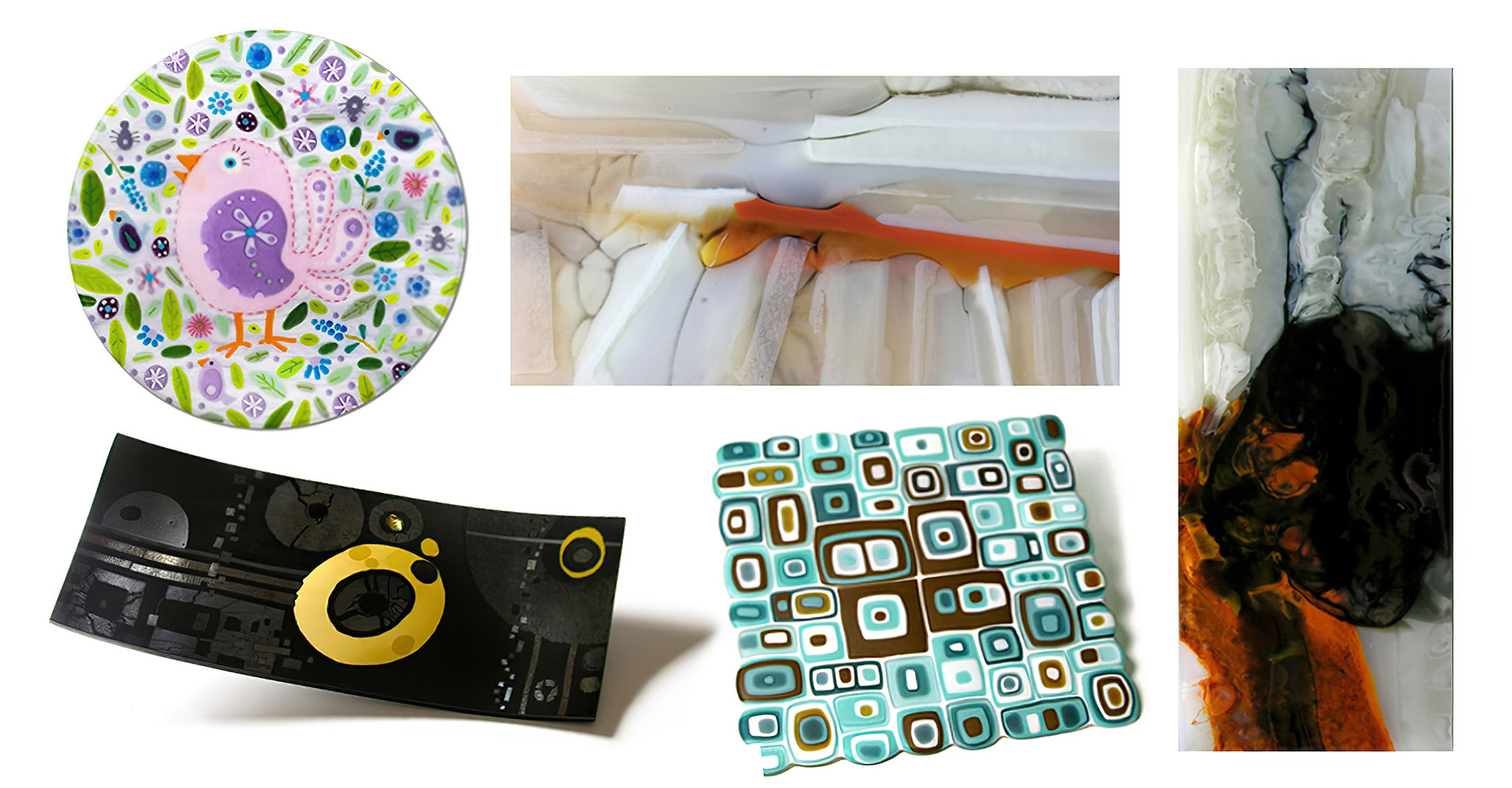
Design for Glass Artists Curriculum
- Part 1 — Dividing the Space (49:50)
- Part 2 — Contrast (40:44)
- Part 3 — Dominant Element (25:20)
- Part 4 — Grace Notes (18:38)
- Part 5 — Jewelry: Design in Small Spaces (14:31)
- Part 6 — Multiples (26:54)
- Part 7 — Shapes (16:02)
- Part 8 — The Double- and Triple-Play (18:28)
- Part 9 — BONUS VIDEO! It Could Have Been Better (15:53)
- Part 10 — Exercises (11:15)
- A (Very Brief) Word about Color
- Index of Artworks
- About Kim+Kat Glass
- Helpful Links

Meet Your Instructor, Kim Brill
Decades of Design Experience
My degree is in graphic design, and I am winding down a career as an art director and designer. When I began fusing glass in 2005, I realized that as a glass newbie, I could do nice work with no technique or other skills if I relied on good design. Planning a piece of glass is not that different from designing an advertisement or a book cover. The same guidelines apply.
This comes pretty easily to me now only because I've been at it for so long. It used to be hard. Since that time I've figured out some basic universal design themes that helped me coach young graphic designers into better results. And I found out how to talk about these things without falling into what I call "MFA-speak" — that lofty, philosophical, hard-to-follow language that some artists use.
I needed more practical, easily-digestible ways to speak about design. And that's what this tutorial is about.
Improving your design skills is a worthwhile exercise, but it does require a bit of commitment and a willingness to see things anew. And it takes practice — but your brain is flexible and trainable. Like anything else, do this long enough and it becomes second nature. Remember when you were learning how to drive? Same thing here. Practice makes it better and easier.
Exercises and Practice Sheets in a Helpful PDF
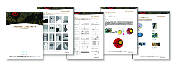
We have developed some design exercises and what we call "cheat sheets" to help limber up your brain's design muscles. There are pages you can use to work out your designs — just print the pdf and then you can work on the cheat sheets with pencils, markers, digital drawing tools — or you can jump right into glass. However you wish to to work, use these exercises to start learning how to think like a designer.
