

Here's something a little different from Kim+Kat Glass.
We're a couple of old dogs trying new tricks with glass. For the first time, the content presented will not rely upon video lessons, but instead will provide a comprehensive PDF reference e-book for your studio. There is so much to look at here! We have found our newest passion in powders. And we have cooked up numerous color tiles with blends and dilutions to help you imagine your projects with a much larger color palette of Bullseye powders than you currently have on hand. If you're an artist whose childhood heart went pitter-patter at the thought of a new box of 64 Crayola Crayons, you are in for a treat.
Not all heroes wear capes. Some wear Band-aids.
__A.G., glass artist
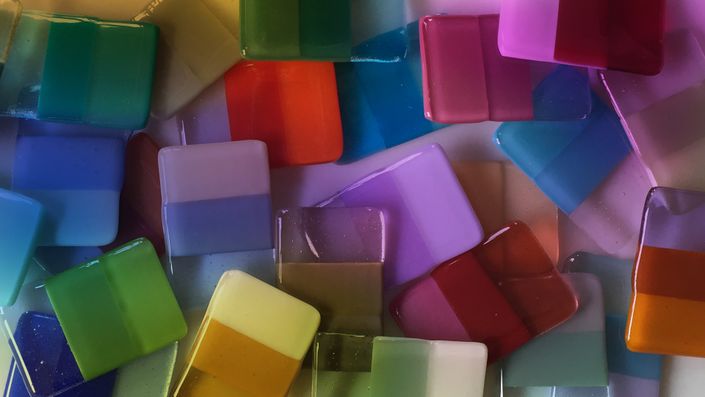
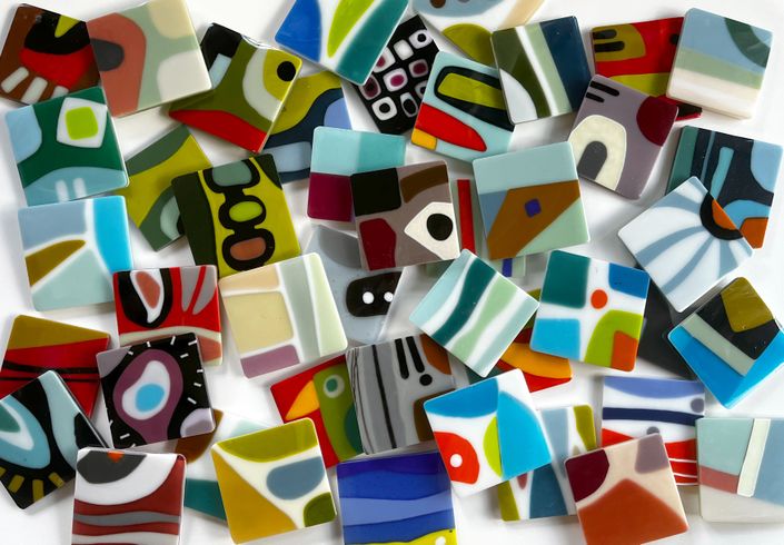
More than 1,400 unique color combinations
Using most of the powders in the Bullseye catalog, we have made dilutions with white, so you can see a color become lighter. We've blended with Deco Gray, in order to provide a softer and more muted palette. And we've played around with Neo Lavender, just for the heck of it.
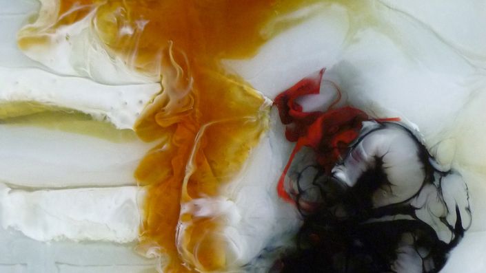
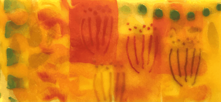
But our favorite new hues come from seemingly random, interesting blends that provide some truly breathtaking colors. Spring Green blended with Light Turquoise? Be still, my heart. Salmon Pink with Neo Lavender? Wow. And just for fun, we took a stab at creating some blends to approximate some BE colors that are not presently offered as powders. Do you wish you could buy Robin's Egg or Peacock in a powder? We have the recipes for those.
Our blends are made with two colors, and most of them follow this 25% increment method. And there are a couple of quick how-to videos to show you how we made our combinations, just to make it super-simple for you to recreate these blends — and discover new ones — on your own.


Your new go-to ebook: a 100-page PDF document with 1,400 unique color blends
Our beautifully designed PDF will become an essential reference book for your studio. It would take a lifetime to whip up all possible blends from all available powders, so we have carefully curated well over a thousand two-color sequences that we found to be useful and interesting. So feel free to use this e-book as a reliable jumping-off point to explore blends that suit your particular creative needs.

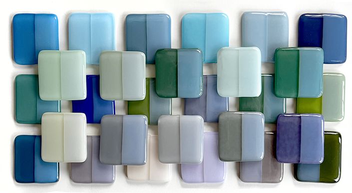
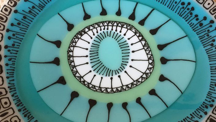
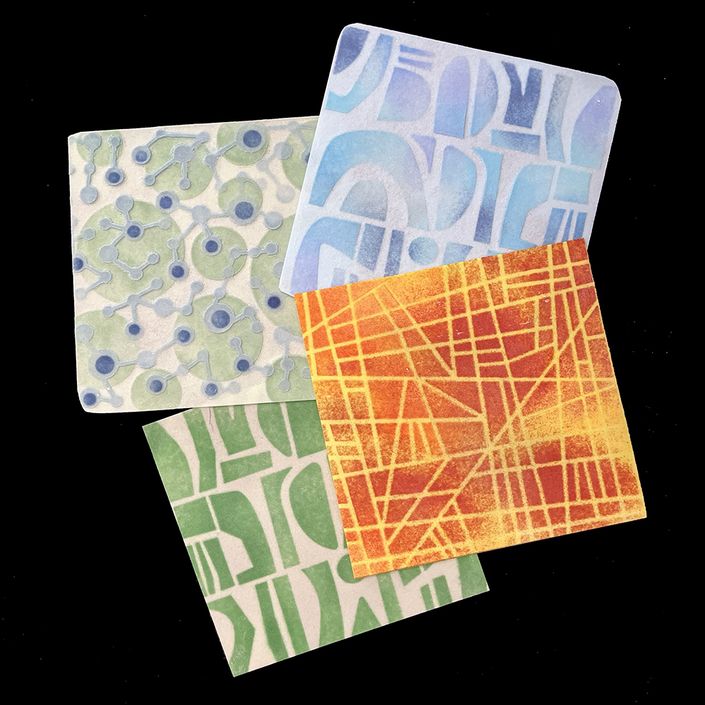
Color, color and more color
This is a very small sampling of our blends, just to give you a tiny taste of what's possible when you fade from one color to another. While this color cookbook is not an exhaustive library of all conceivable color pairs, we have tried to give you as many blends as we reasonably could, with the aim of getting you started in your own color mixing experiments. You'll be baking custom color combinations in no time!
If you cook up a new recipe and would like to share, we have a private FB group for artists who wish to connect over their common obsession with BE glass and color.
Each Chapter Addresses A Different Type of Color Blend
Chapter 1: Introduction
Everything you need to know about this color guide, and making color sample tiles. Plus, two quick videos will demonstrate blending methods.
Chapter 2: Blends to 113 White
Learn how you can maximize your favorite color by making graduated steps with white.
Chapter 3: Blends to 1442 Neo-Lavender
Transparent Neo-Lavender blends provide us with some weird and wonderful new colors.
Chapter 4: Blends to 136 Deco Gray
The Deco Gray blends provide a soft, subtle and muted set of colors that pair well with just about anything.
Chapter 5: Pale Colors from Dark Colors
There are some colors (looking at you, Orange and Red) that just do not want to fade and blend much. We devised a new protocol using loads of white to get some lovely pastel colors that are a great addition to our expanded palette.
Chapter 6: Interesting Two-color Blends
This is our favorite chapter. We made some wild and crazy combinations to find out how far we could truly stretch the powder palette.
Chapter 7: Bullseye Color Approximations
There are a small number of sheet glasses that are not available in powders, so we took a run at getting close to a few of them. We are loving the Robin's Egg Blue mixture we discovered.
Chapter 8: Suggested Color Palettes
In case you're not sure where to start, we have put together some sample color palettes that can help you get going on your next project.
Meet Your Instructor, Kim Brill
Kim Brill has been making acclaimed kilnformed glass since 2005. A resident of Austin, TX, Kim began developing online glass tutorials after a long career as an art director and graphic designer. Her work has won an honorable mention at Bullseye's Emerge international juried competition, and has appeared in The Corning Museum of Glass international publication New Glass Review.
You can see her work at www.KimBrillGlass.com

We are proud to use Bullseye glass exclusively in our tutorials and our personal work.
Check out our other color ebooks and tutorials! Some of them are free.
We are working on new content all the time.
Our tutorials are professionally produced -- no iPhone video here! Some tutorials on other platforms can expire or limit the number of times you can see a lesson. We don't do that. We understand that sometimes life can get in the way of art. So come back whenever you'd like. Your tutorials will be here.


Check your inbox to confirm your subscription